Auto Finance Dealer
The previous process lacked accessibility, users demanded additional features, and there was a need to streamline operations to enable quicker vehicle flooring.
Development ready screens
Project Type
UX/UI Redesign
Collaboration
Product Owners
Product Manager
Stakeholders
Technical Directors
Development Leads
Front End Engineers
Platforms
Web, Tablet, Mobile: IOS, Android
Timeline
Q2 2022 - Q1 2023
Role & responsibilities
Lead Product Designer
User Research, Sketching, Wireframing, Visual Design, Prototyping, User Testing, Interaction Design, Dev Handoff
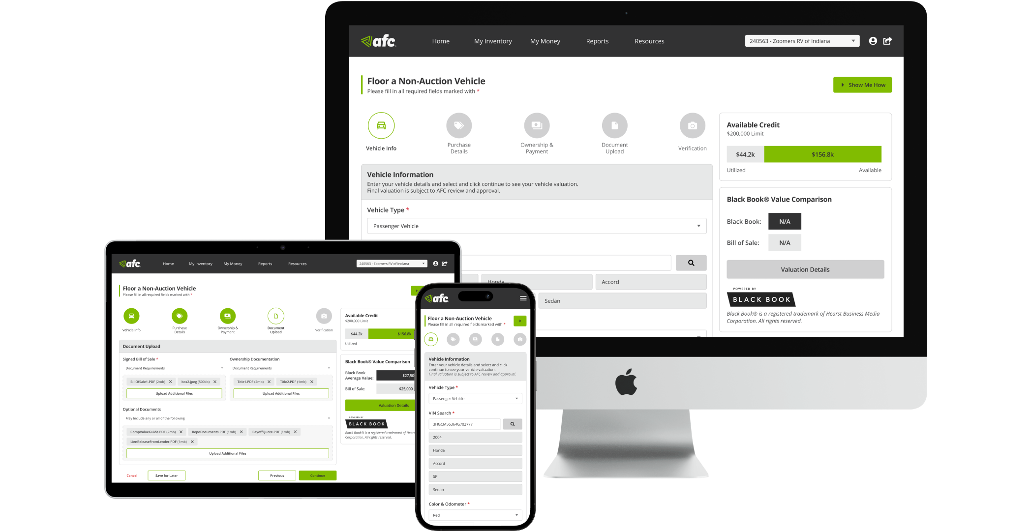
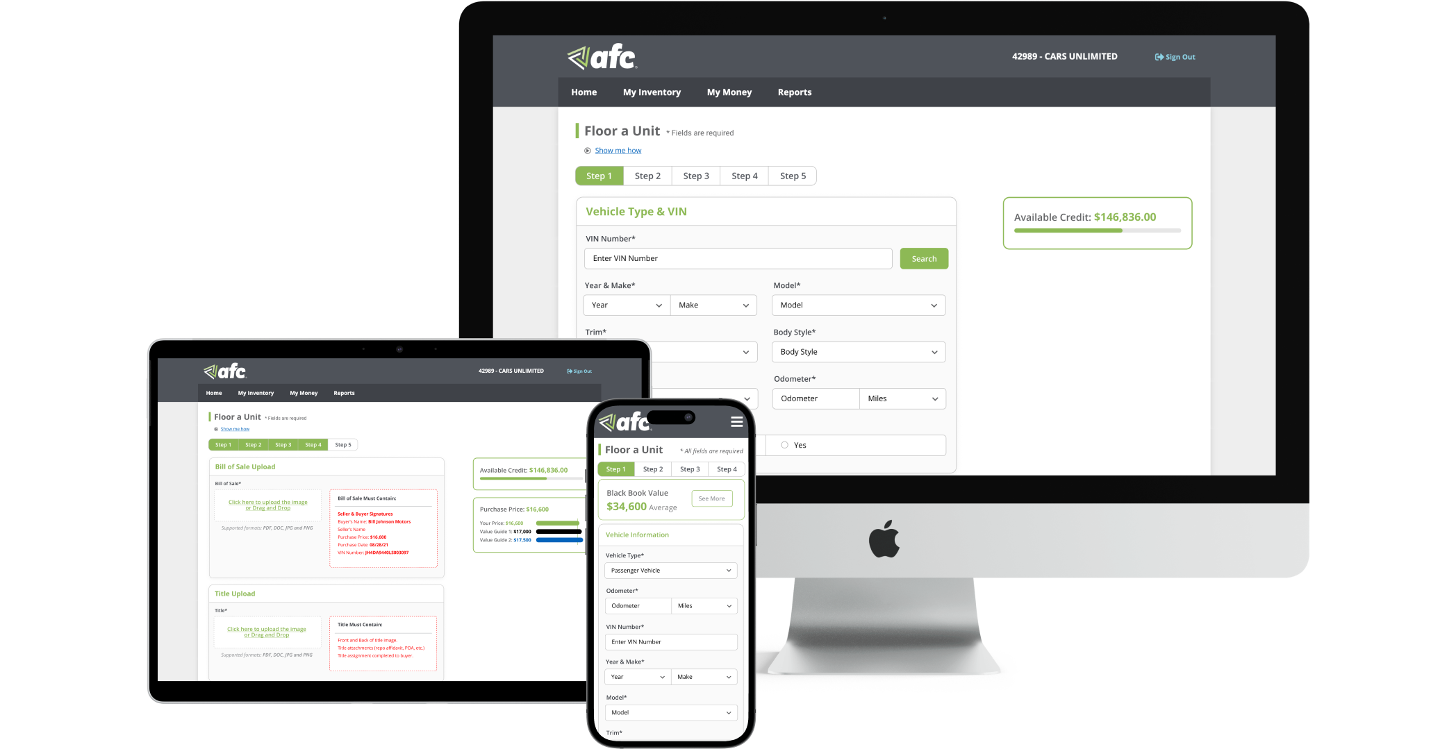
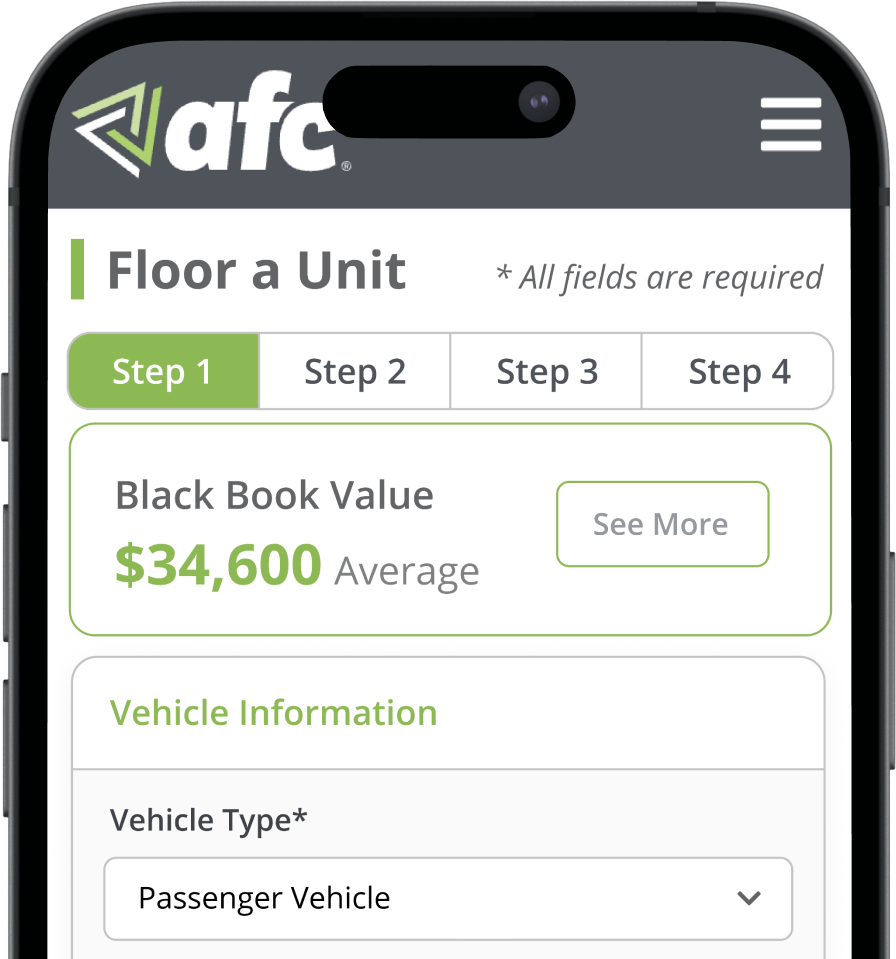
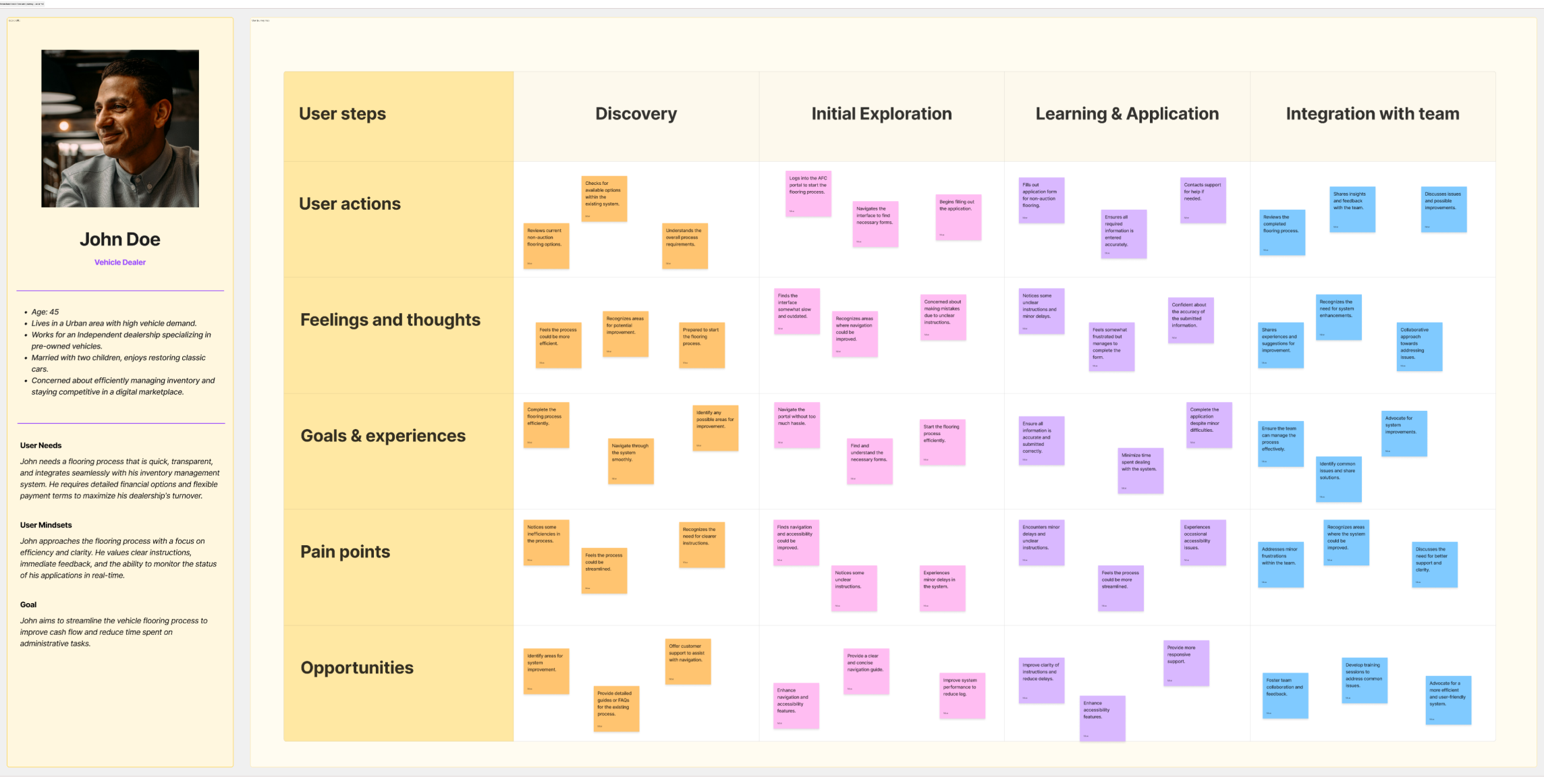
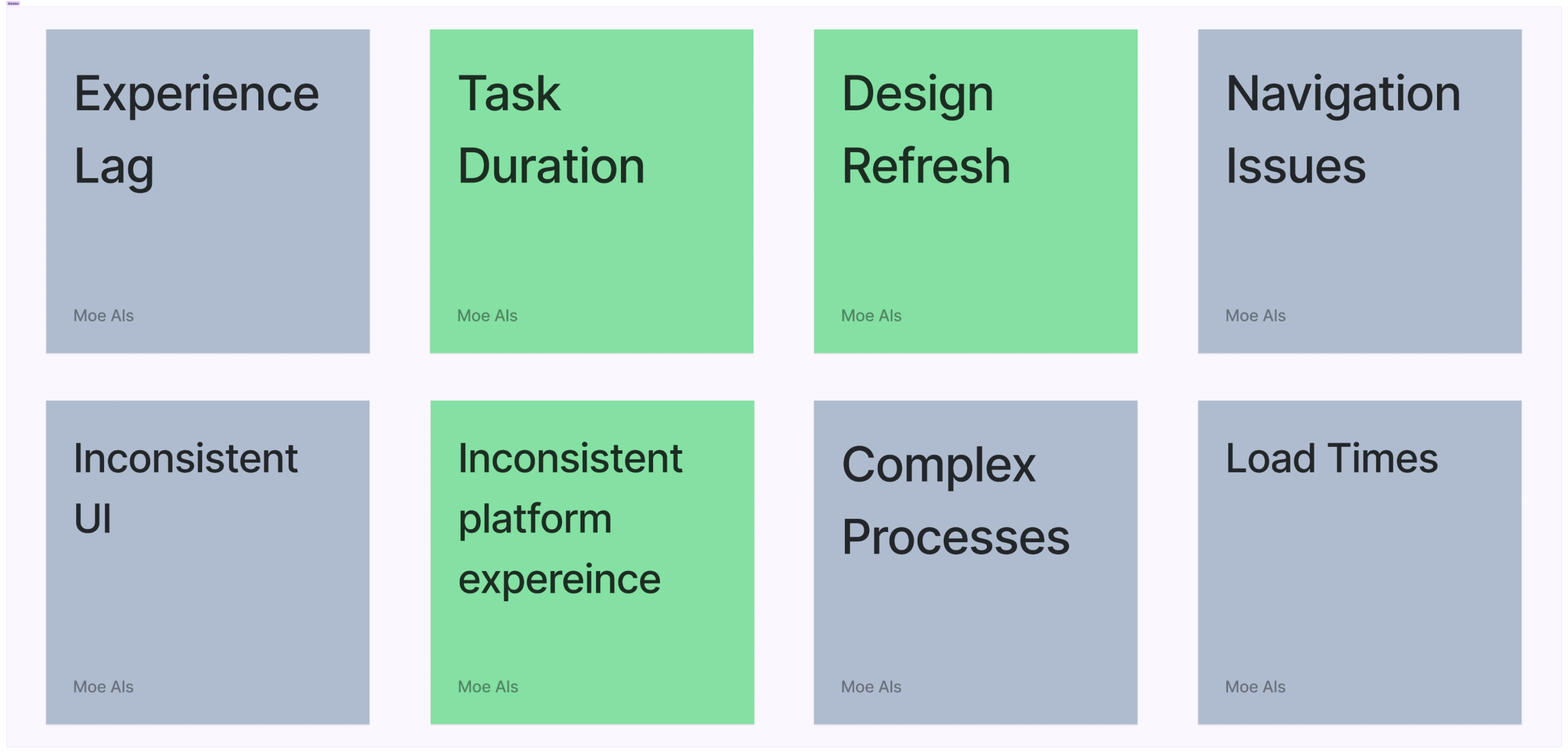
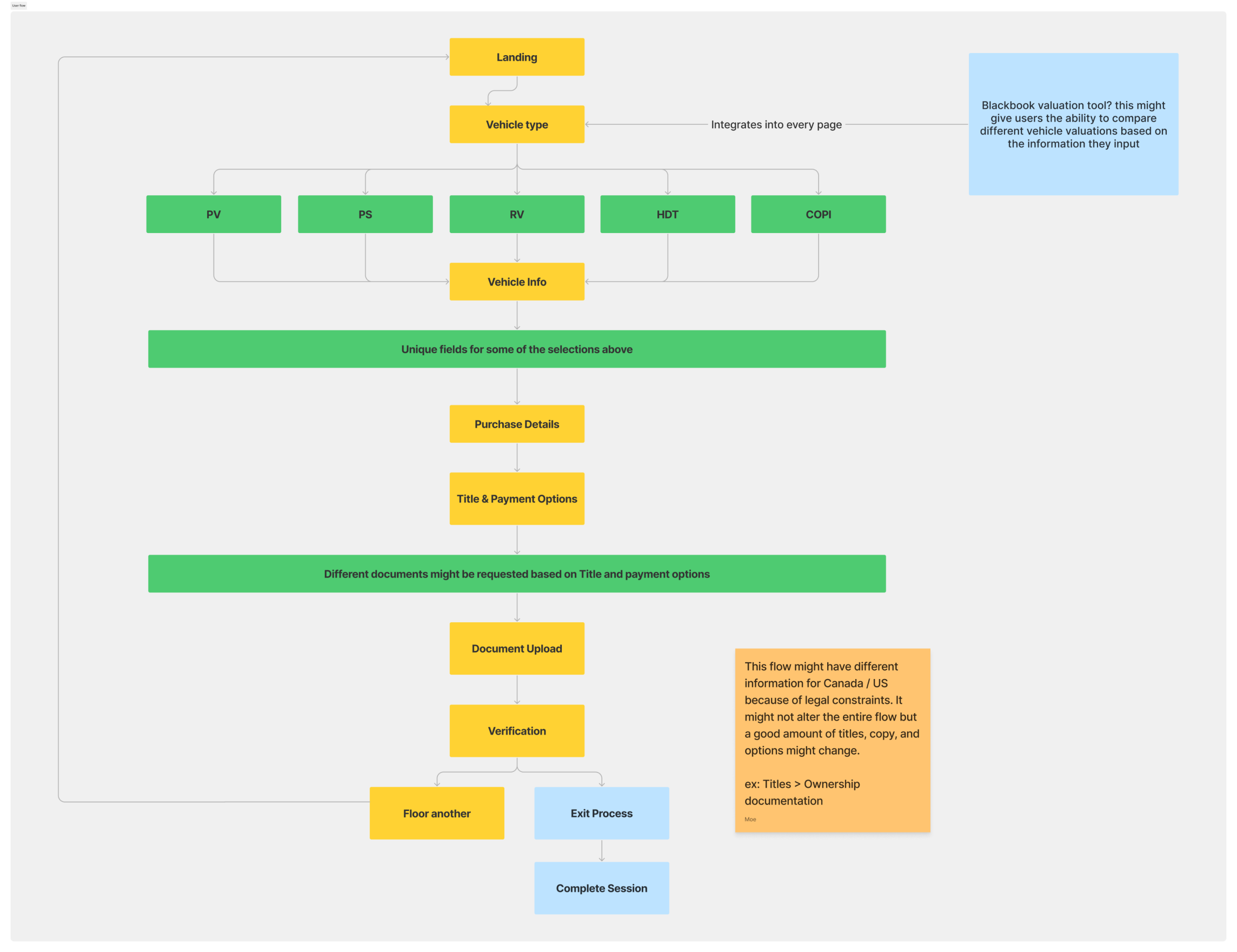
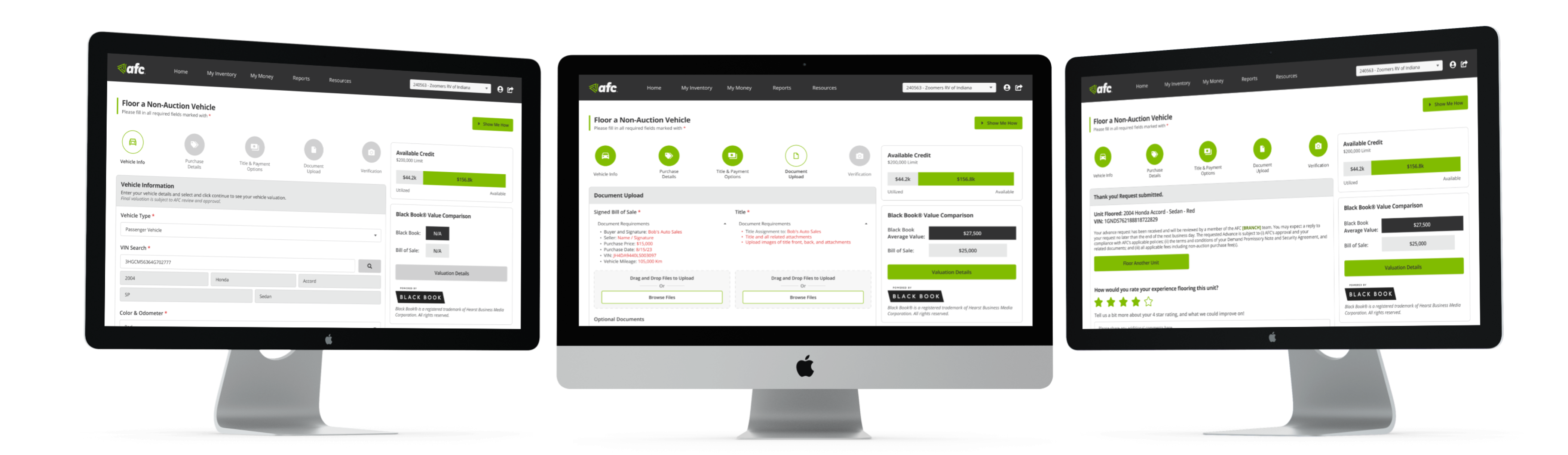
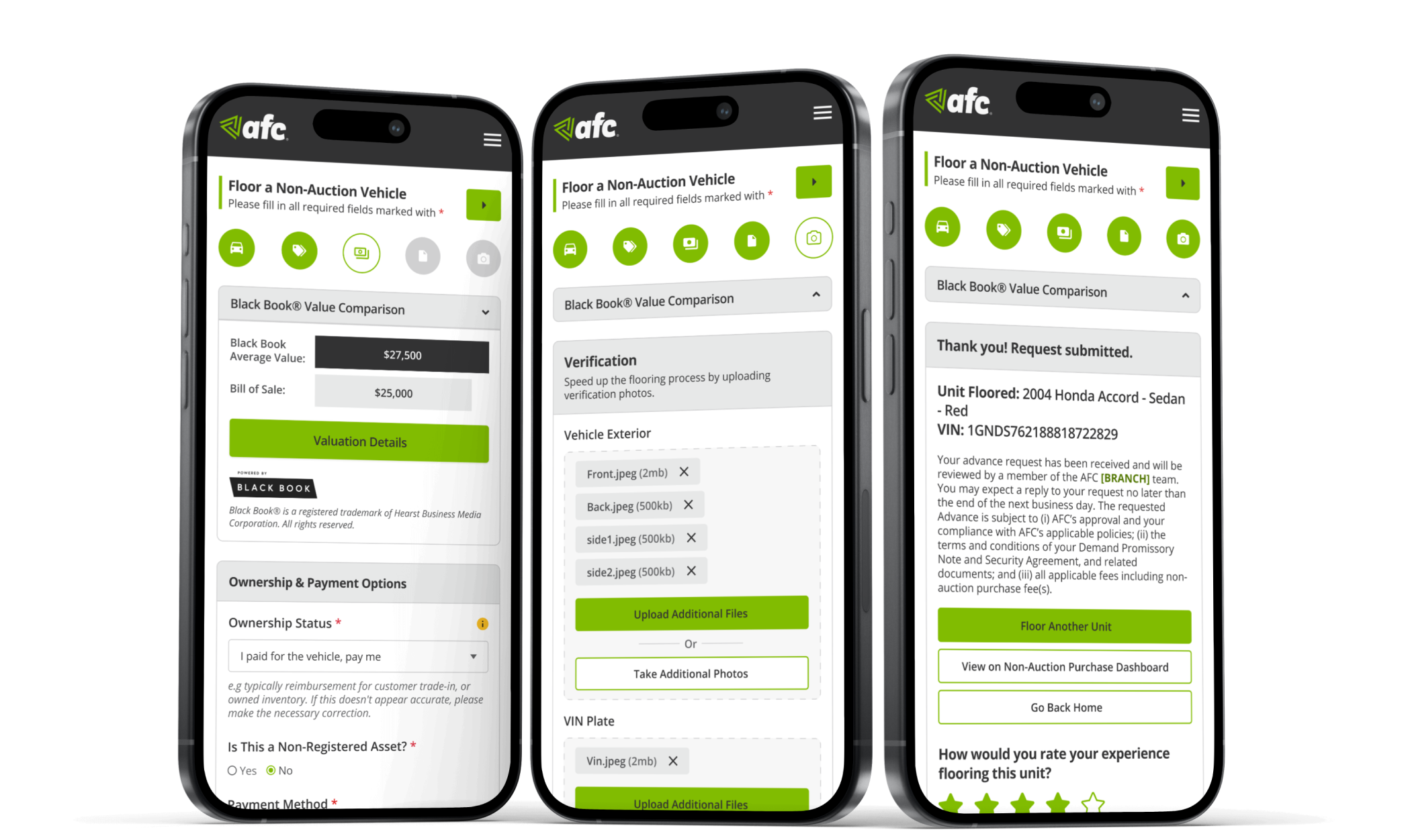
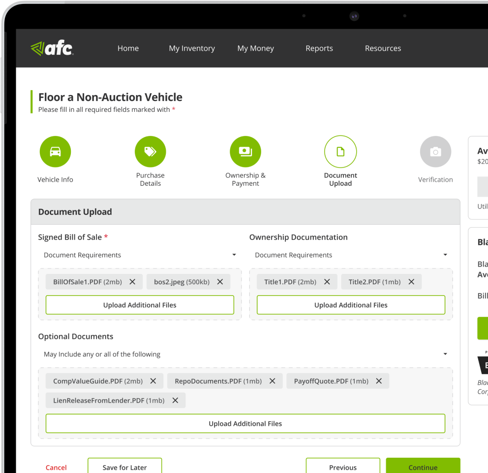
The NAP (Non-Auction Purchase) Inventory Financing Process, also known as 'Flooring,' involves an interactive form that dealers complete to secure short-term financing for purchasing inventory. This process had challenges with high dropout rates and disorganized content, and important details were often difficult to find due to ineffective color and font choices. These issues led to a redesign aimed at simplifying the form and improving its usability.
As the digital auto industry expands, AFC faces increasing competition in offering services that are easy and clear to use. Maintaining its market position hinges on the simplicity and clarity of completing tasks. Recognizing the value of user time, I focused my redesign strategy and success principles on optimizing efficiency and user experience.
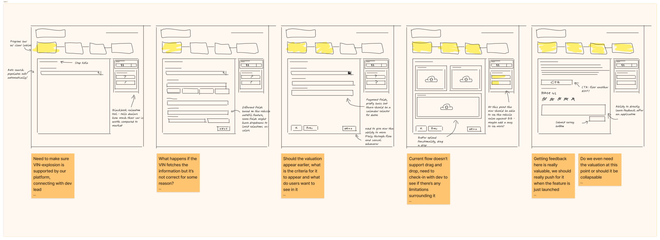
Enhancing User Flow
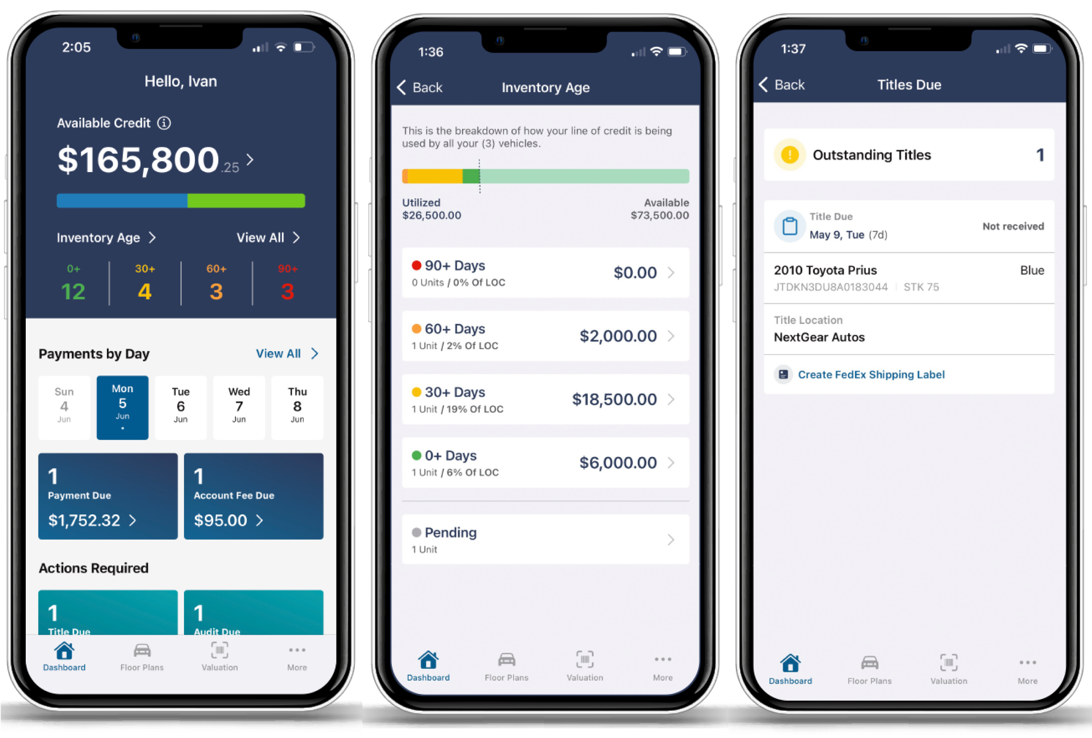
Streamlining process steps and organizing related information will enable users to transition smoothly from one task to another without unnecessary interruptions.
Addressing Accessibility Issues
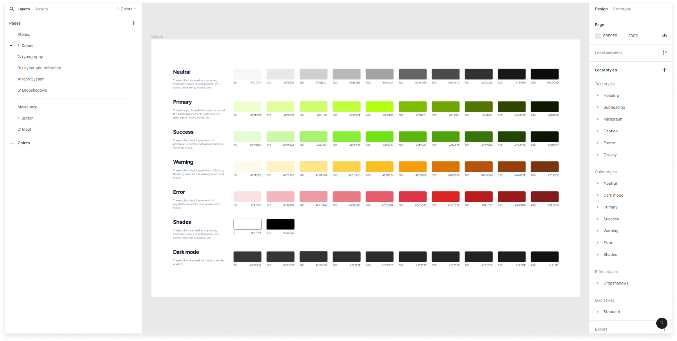
Creating a design system to meet WCAG standards is critical. Elements must be clear, easy to understand, and responsive.
Reducing Process Time
Streamlining the flow and resolving accessibility issues will help users complete tasks faster. Implementing a failsafe system for incomplete applications is also important.
Old process screens
To fully grasp how our primary users interact with our processes, what drives their behavior, and the underlying reasons for high dropout rates and frequent requests for new features, I employed the following research methods:
Method 1:
Competitive Analysis
Conducted internal research and interviews with stakeholders to assess our competitive landscape and identify improvement areas.
Method 2:
Qualitative Research
Performed user interviews and remote walkthroughs to uncover deep insights into user pain points through open-ended questions.
Method 3:
Quantitative Research
Executed A/B tests and gathered data via surveys with closed-ended questions to identify which designs best meet user expectations.
AFC’s traditional, location-based business model faces challenges from digital-first competitors like NextGear, which attract a tech-savvy demographic with efficient, accessible apps. To remain competitive, AFC must evaluate the potential benefits of adopting a similar digital strategy.
Nextgear Capital was highlighted as AFC’s main
competitor by leadership
I explored whether concerns about NextGear’s digital-first solutions were shared beyond our management team. I conducted a brief survey to gather primary users' opinions on NextGear’s app and flooring process.
Over a few weeks, I interviewed over a dozen internal and external users who manage extensive inventories. This approach aimed to uncover nuanced perspectives and hidden challenges that surface-level data might miss.
User Interviews
>
“It’s just very slow, and the process can get a bit confusing at times, the steps aren’t really labelled either”
>
“Very outdated, looking at other apps on the market and comparing them to what we have currently is disappointing”
>
“I think it’s the way the process is structured? Vehicle information is broken down over 2 steps instead of just one”
User Interviews
>
“Lots of web features are just not available on mobile, I might use it more if that were different but I’m not sure”
>
“I use both but I prefer using the website over the app almost always, it’s just a lot easier to manage and use”
Remote Walkthrough
Remote Walkthrough
The competitive analysis and qualitative data provided a solid foundation, but I needed more quantitative insights to identify clear patterns and inform my solutions.
User Interviews
User Interviews
User Interviews
The competitive analysis and qualitative data provided a solid foundation, but I needed more quantitative insights to identify clear patterns and inform my solutions. I started by mapping out a user journey, focusing on pain points and improvement opportunities.
With the research phase complete, it’s time to address the key issues identified. Drawing from user feedback and comments, I’ve pinpointed common pain points and proposed targeted solutions:
Time on Task
Users spend too much time completing tasks on both web and mobile platforms.
Design Refresh
AFCD’s design requires updates to streamline the flow and resolve usability issues.
Mobile and Web Experience
The current experience needs significant improvements to improve user ratings.
With a solid set of data to work from, it was time to start mapping out the site. I revisited the structure to group information correctly and identify refinements and bottlenecks. Additionally, I had to consider the legal limitations between Canada and the US, as this feature was being released in both regions.
With solid data and many enhancement ideas in hand, I was ready to execute but faced a key limitation: our outdated codebase. This had caused previous bottlenecks, so I engaged the development team early during wireframing and sketching, actively discussing features and ideas to ensure smooth implementation.
Before diving into high-fidelity designs, I faced another hurdle. The business had its limitations, and the previous designer never used a design system. There was a rough color palette and no consistent fonts or icon styles. Without the resources to build a full design system, I created a basic style guide for colors and fonts to keep the project moving forward.
After hours of research, meetings, and brainstorming sessions, I had everything needed to create a user-friendly process. This design addressed navigation issues and confusion in the flow, receiving overwhelmingly positive feedback during closed testing.
New (left) vs. Old (right)
The new design system has enhanced the product by providing a consistent framework and an accessible color palette. This update simplifies development and improves the user experience.
New design system across different process screens
The redesigned mobile platform now meets user expectations and accessibility standards. Users will likely prefer and use the mobile version more frequently due to its improved usability and accessibility.
New (left) vs. Old (right)
New design system across different process screens
Executing this project as AFC's sole designer was challenging. Through collaboration, design-oriented thinking, and thorough research, the flooring process was immensely improved. This provided users with the desired functionality while aligning with business needs and budget constraints. I created over 200 pages and states, and added annotations for developer clarity. These improvements have been released to users across North America. The data below summarizes the impact of these changes.
User Interviews
>
“The new look and feel of the interface are way better and easier to handle. It's like using an app that just clicks for me, you know? Nothing seems old-school, and I'm not scratching my head trying to figure out how things work anymore!”
>
“I bet dealers will be way happier with this. It hands them a ton of power, and it could be the solution they've been needing, especially since they&Aapos;re always ringing up the offices for help. I see this as a move in the right direction, and with some good coaching and support, even the older folks will catch on.”
Sharpstakes
View Project
Shiba Inu
View Project
Don't hesitate to get in touch through any of my social media channels.
Alternatively, you can drop me an email at design.moexls@gmail.com. I look forward to hearing from you!